May 2024
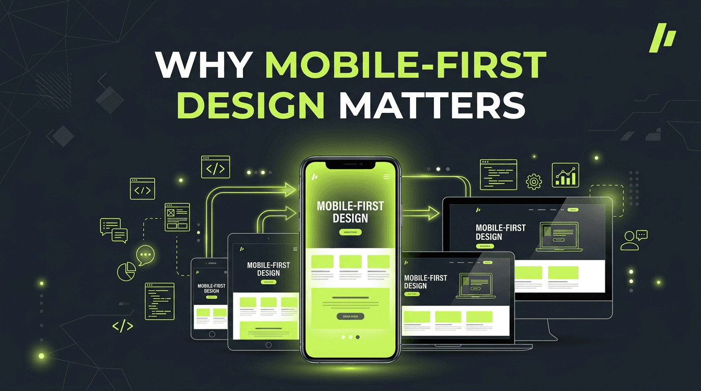
Why mobile-first design matters
Mobile traffic has overtaken desktop in most sectors. Designing for mobile first forces you to prioritise what matters: core content, clear navigation, and fast actions. What works on a small screen usually scales up well; the reverse is rarely true.
Mobile-first also improves performance. A layout built for narrow viewports tends to load fewer assets and use simpler CSS. Touch targets need to be larger, which benefits usability across devices. Responsive breakpoints should add complexity as screens grow, not strip it away.
Start with wireframes for 320px width. Test on real devices. Then expand to tablet and desktop. Your users — and your conversion rates — will thank you.
Touch targets should be at least 44×44 pixels. Links and buttons need enough spacing so users don't tap the wrong one. Avoid hover-only interactions — mobile has no hover. Use tap, swipe, and long-press instead.
Navigation on mobile is different. Hamburger menus are common but hide options. Consider a bottom nav for key actions, or a simplified top nav with the most important links visible. Test what your audience expects.
Performance and mobile go hand in hand. Mobile networks are slower and less reliable. Optimise images aggressively. Reduce JavaScript. Use responsive images so phones don't download desktop-sized assets. A fast mobile experience is a better experience for everyone.