February 2024
Web design trends that convert
Design trends come and go, but some patterns consistently drive engagement and conversion. Clean layouts with ample whitespace help users focus. Strategic CTAs — visible, action-oriented, and repeated at key decision points — guide users toward goals.
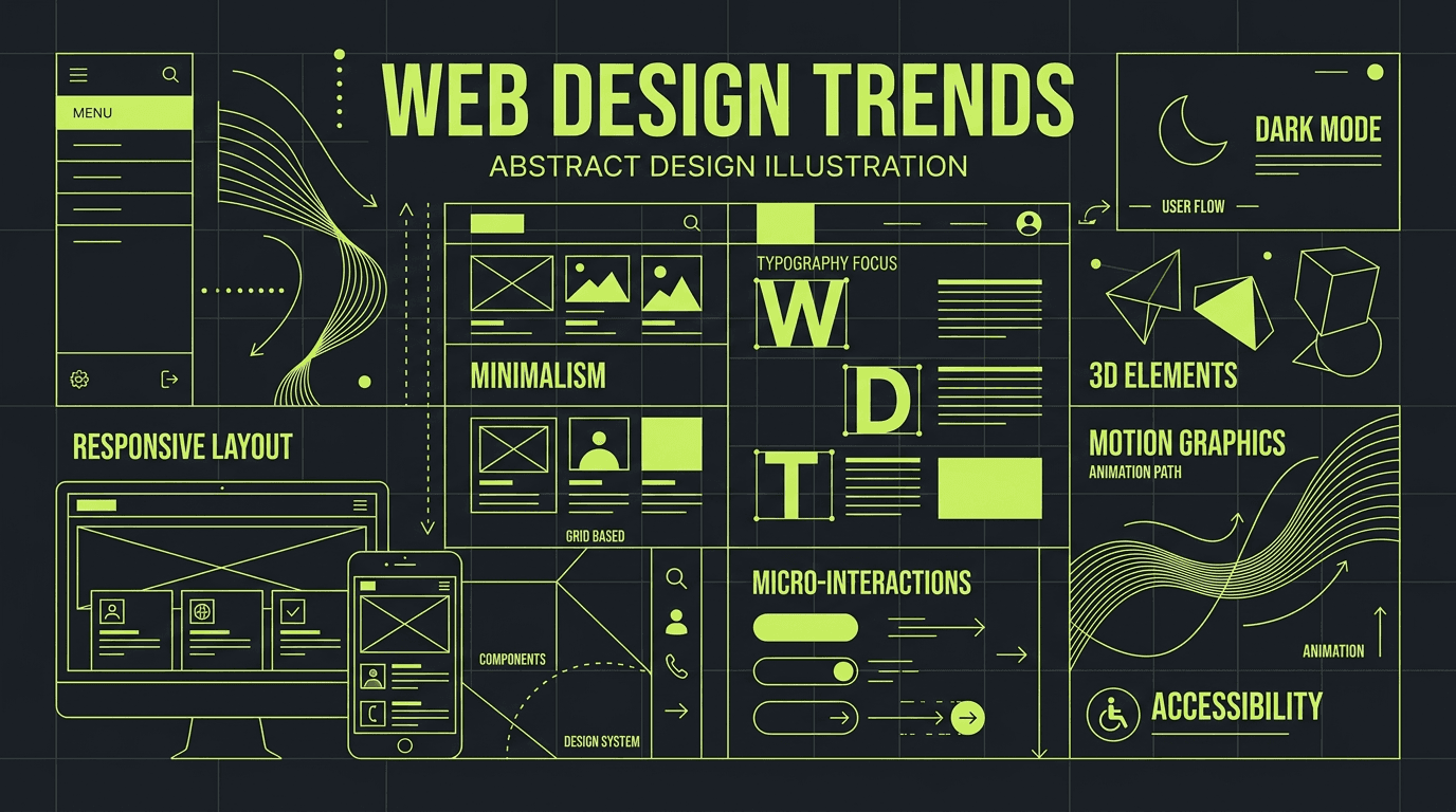
We see strong results with: clear visual hierarchy, scannable content with subheadings and bullets, and trust signals (testimonials, logos) near forms. Dark mode and bold typography work well for tech and creative brands. Motion should support usability, not distract.
The best designs balance aesthetics with conversion. Every element should earn its place. Test, iterate, and keep the user's journey at the centre.
Visual hierarchy matters. Users scan, they don't read. Use size, colour, and spacing to signal importance. The primary action should stand out. Secondary actions can be softer. Avoid competing elements that split attention.
Forms are conversion points. Keep them short. Use inline validation. Show progress on multi-step forms. Place trust signals (security badges, guarantees) near the submit button. A/B test form length — sometimes one fewer field can lift conversions significantly.
Don't chase trends for their own sake. A trend only works if it serves your audience and goals. Minimalism suits some brands; others need more visual richness. The right design feels intentional, not generic.